
I design & build
digital products.
Better & faster.
Brand, Web & App Design | No-Code Development
Startups and agencies hire me to leverage experience, intuition and no-code to design better, and build faster.

About
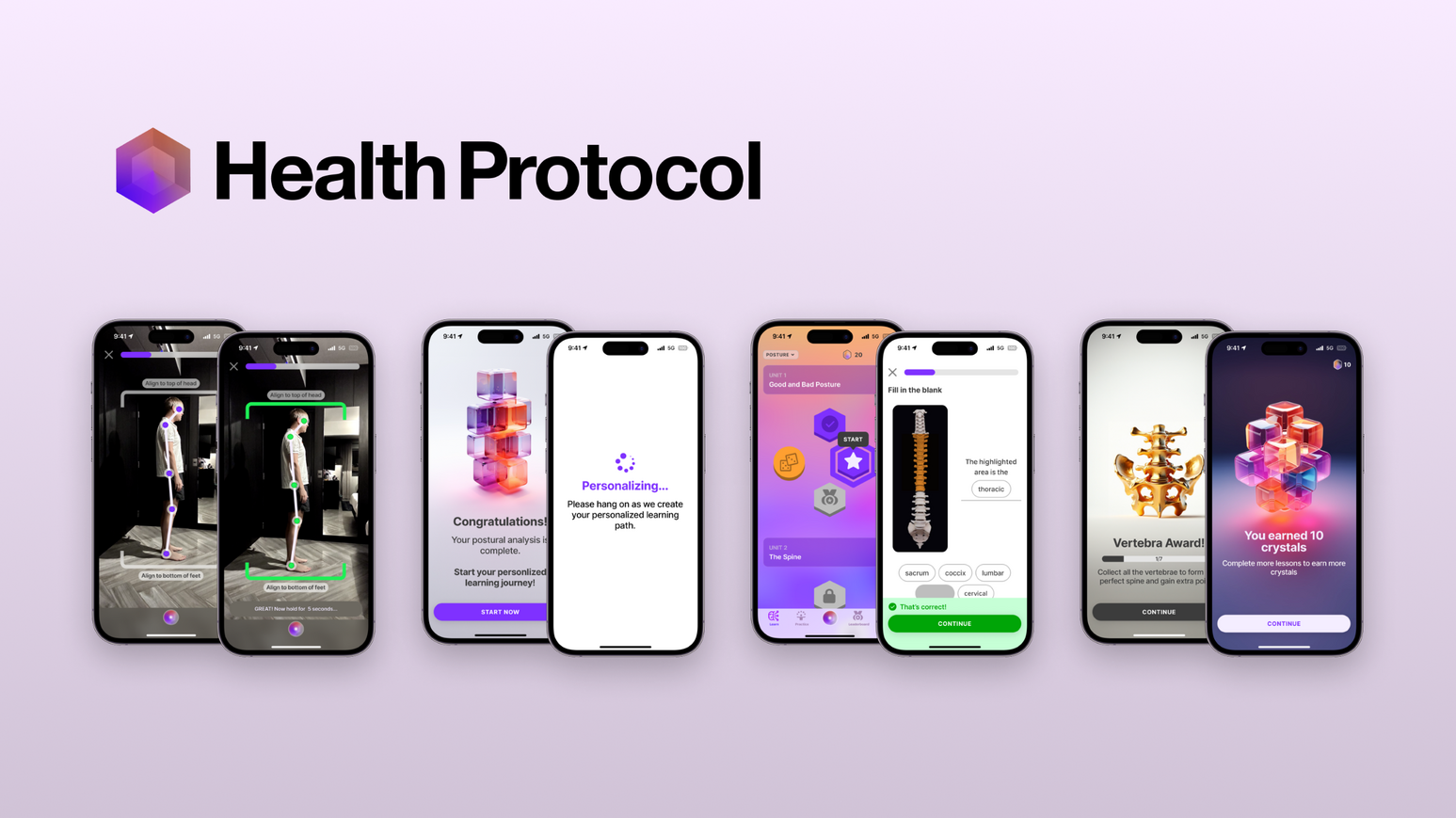
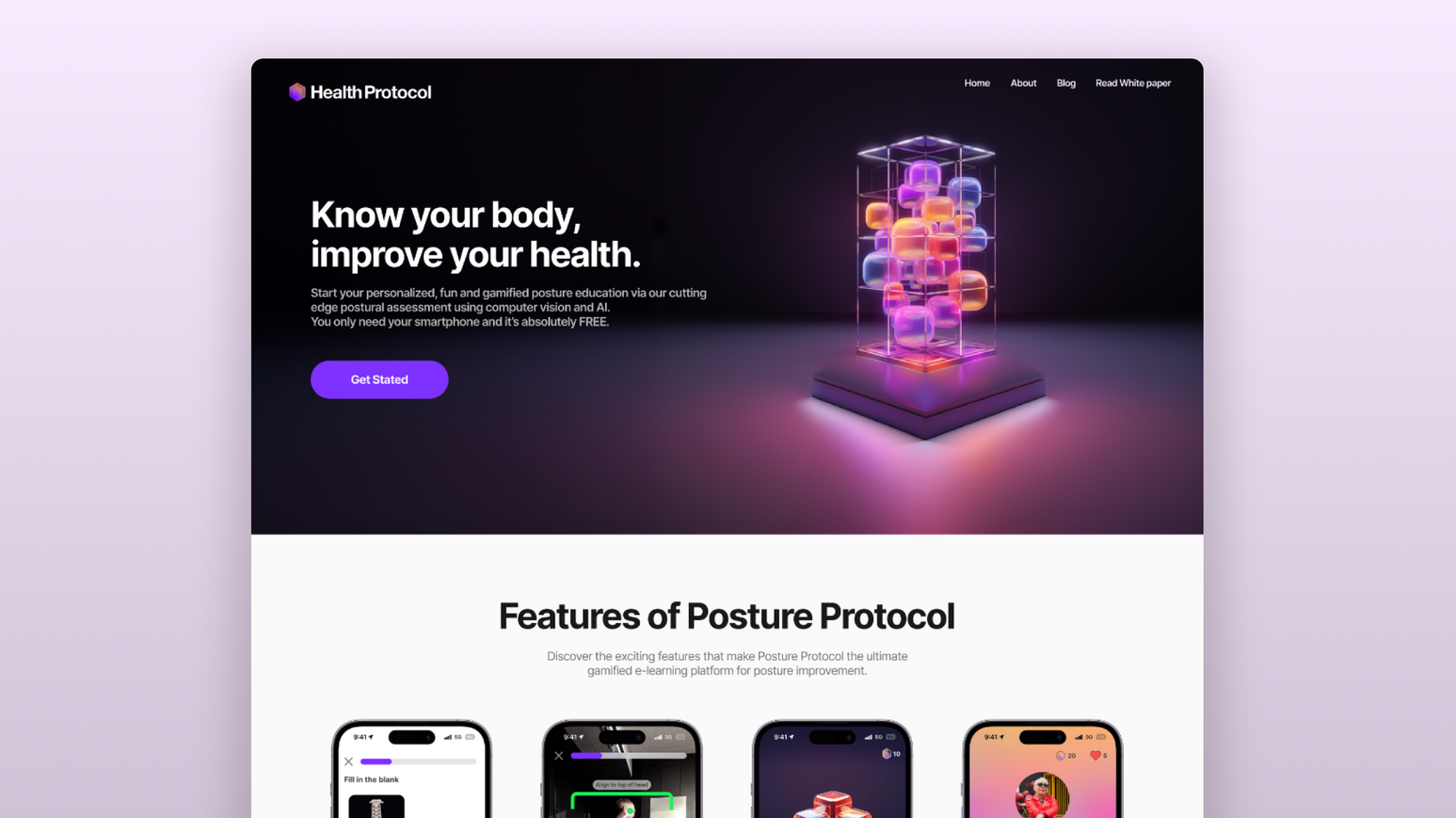
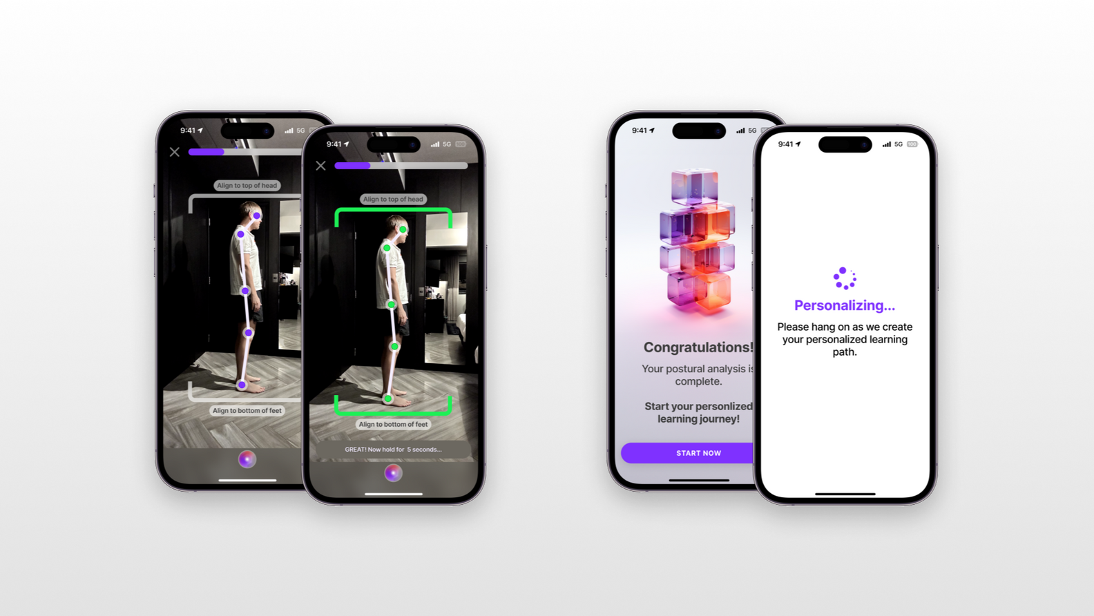
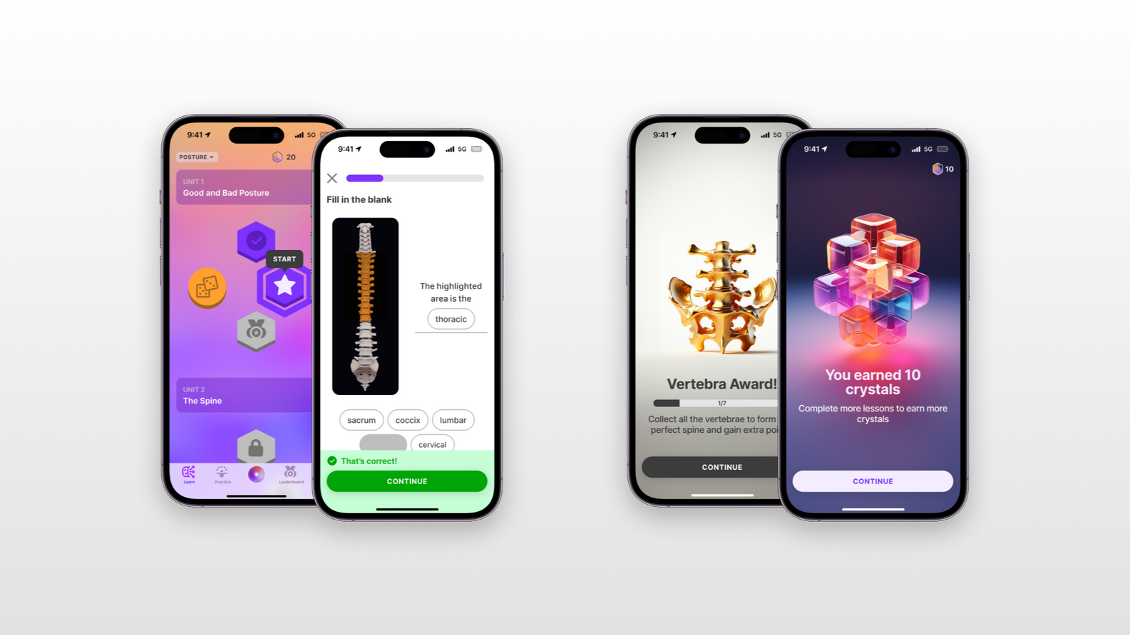
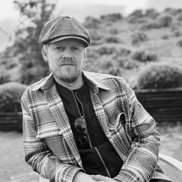
With over 14 years of experience in product design and strategy, Darri Ulfsson is a co-founder and chief product officer of two innovative and impactful ventures: Darkblock.io and Health Protocol. Darkblock is a web3 encryption protocol that enables creators and collectors to protect and monetize their digital assets on the blockchain. Health Protocol is a gamified health education platform that aims to empower a billion people with the knowledge and skills to improve their well-being and prevent chronic diseases.Darri holds an MBA from ThePowerMBA and a bachelor’s degree in visual communication from the Iceland University of the Arts.
Recent Work
Case Studies
Redefining the digital viewing landscape of the Berliner Philharmoniker.
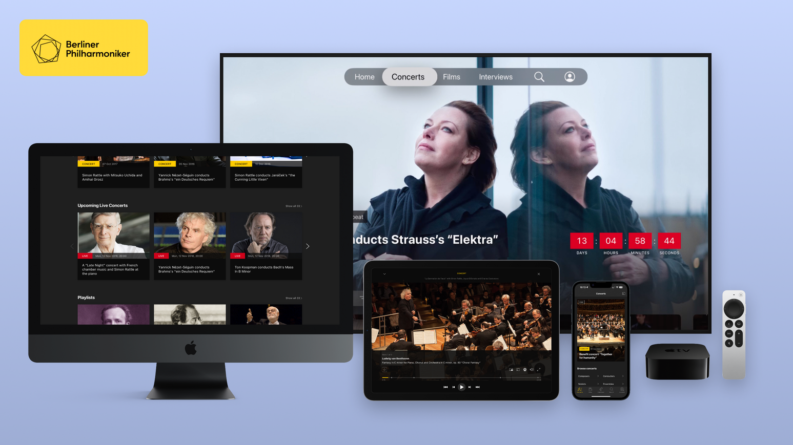
A pioneer in its category, the Berliner Philharmoniker's subscription service is available on most platforms. We helped solved the difficult problem of user experience consistency across a constantly changing tech environment, maintainability and team inclusion.
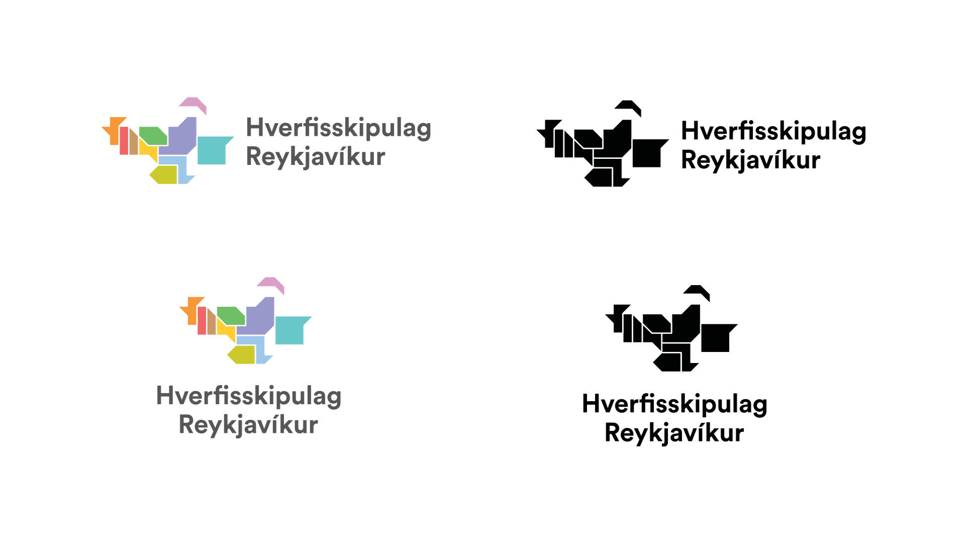
Bringing the City of Reykjavik closer to its citizens through design.
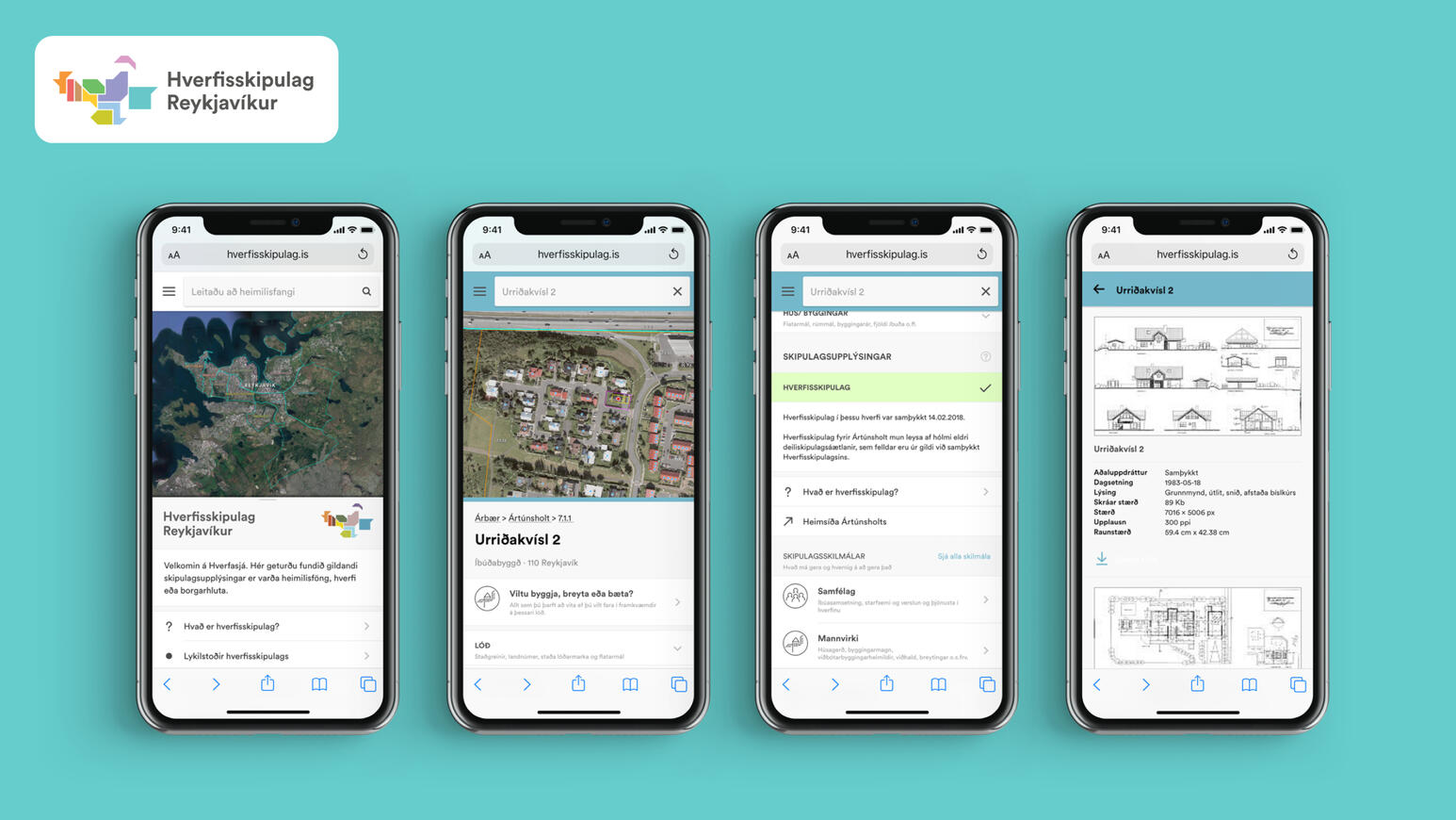
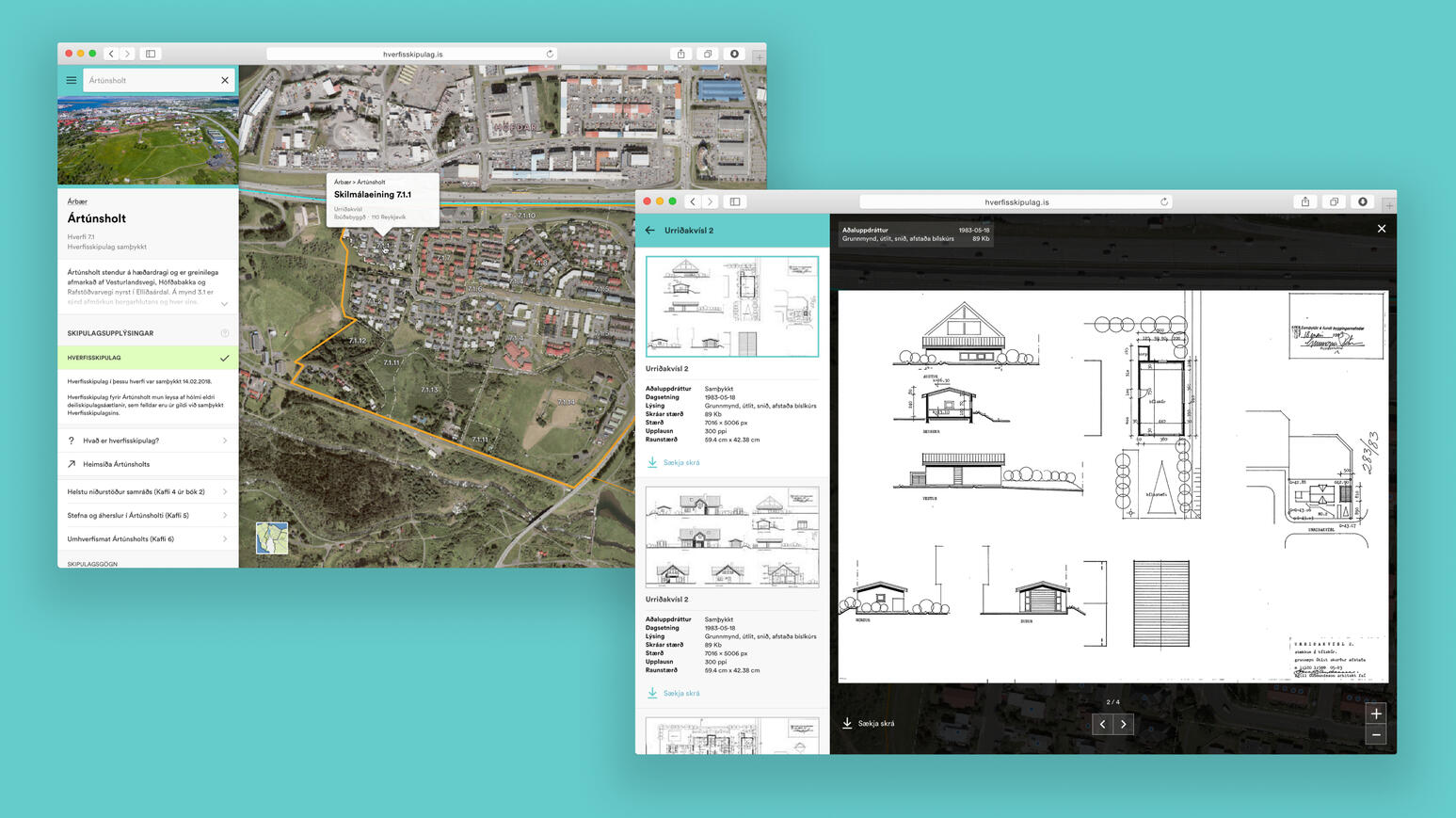
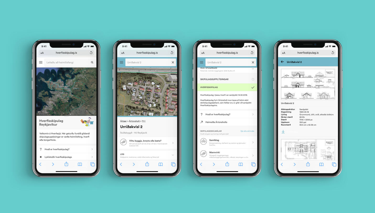
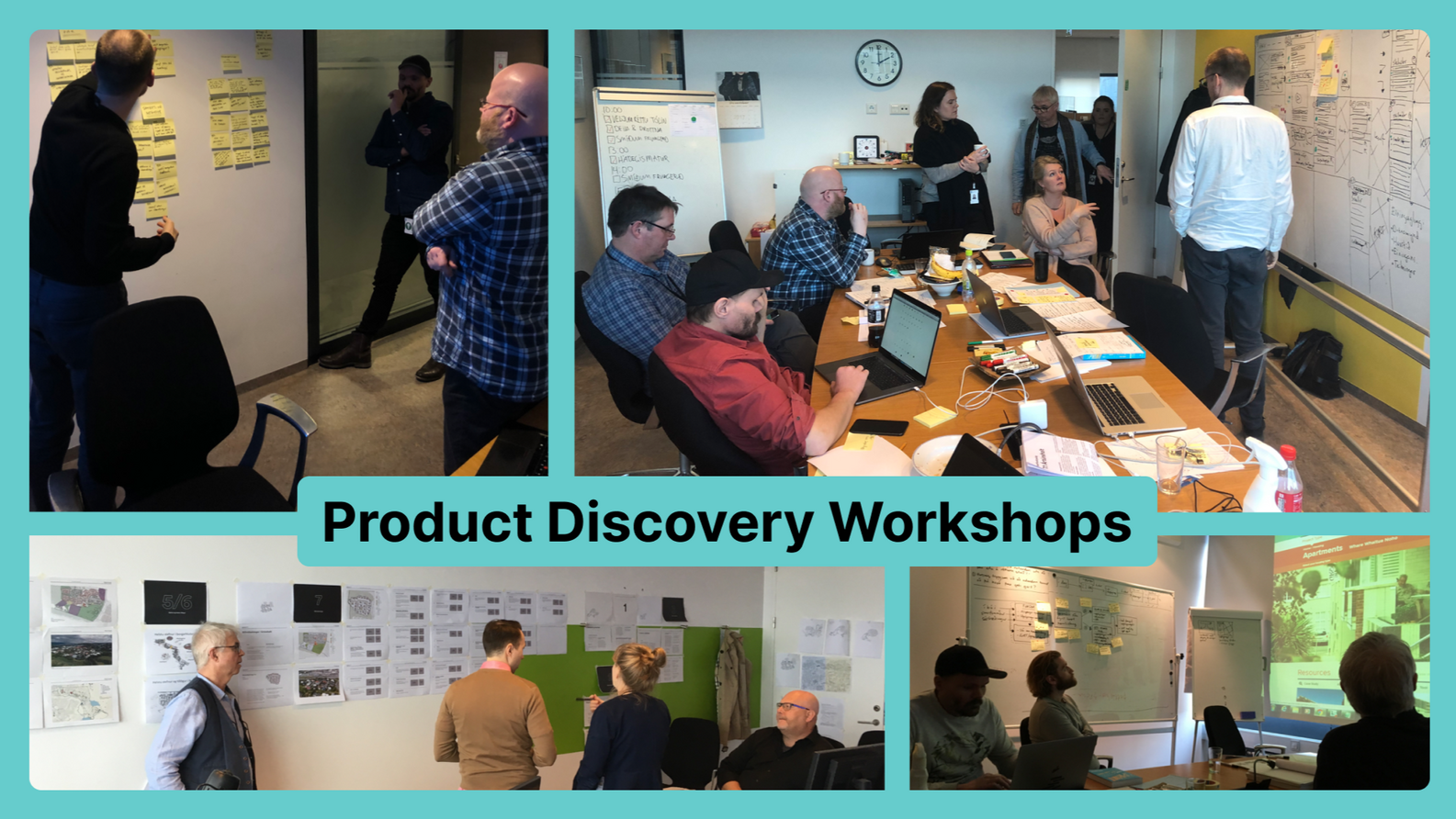
Using a human-centered approach, we helped bring solutions to improve the problem of urban sprawling in the City of Reykjavik. We ran discovery workshops with user testing and redesigned the tools to be used by professionals and citizens alike, focusing on accessibility.
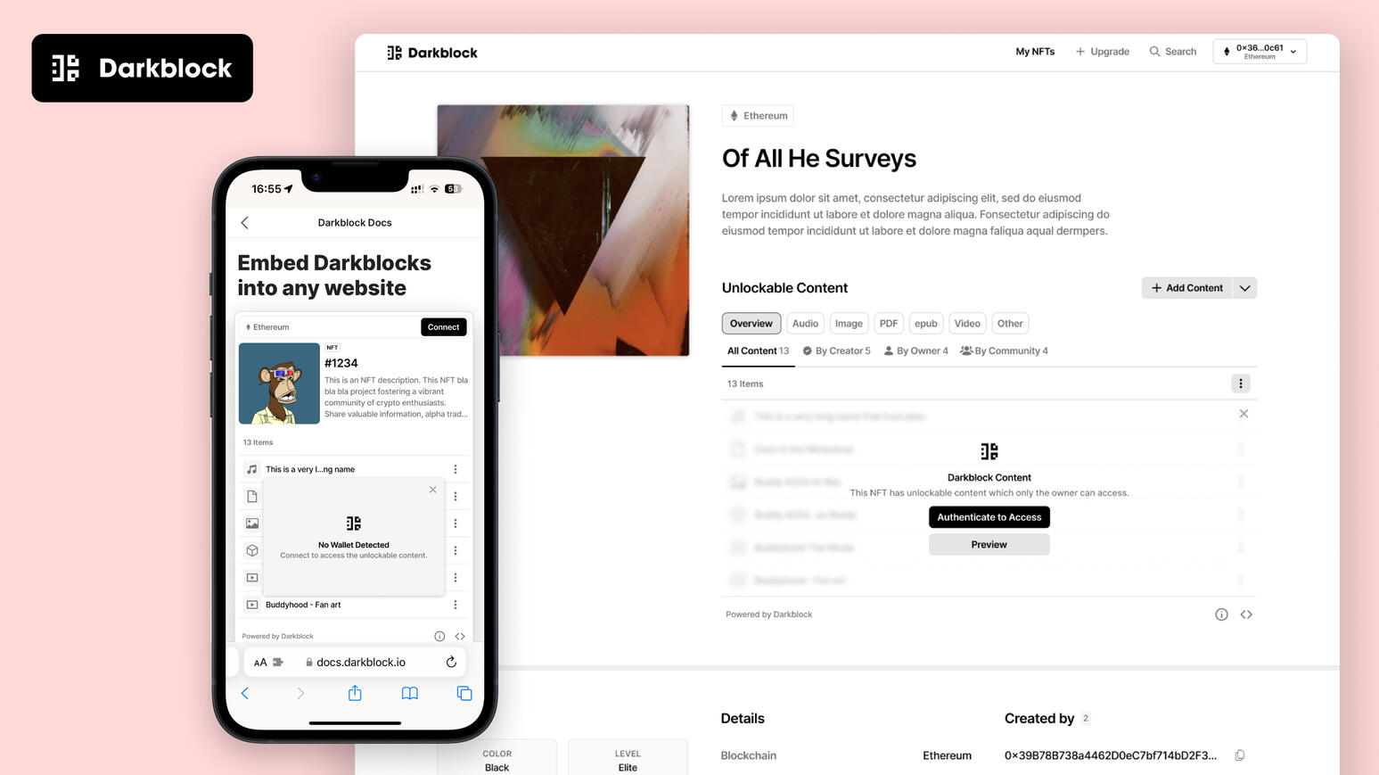
Building Darkblock:
Unlocking the power of token-bound content.
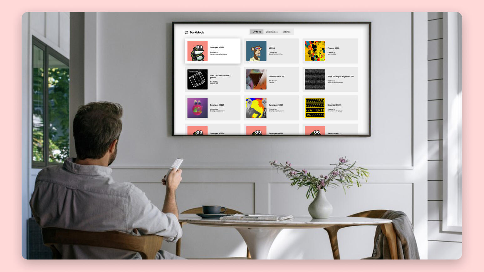
Whether you’re publishing comics, movies, music, eBooks, or metaverse assets, The Darkblock Protocol lets you harness Web3 to deliver exclusive content to your fans, forge stronger ties with your community, and get paid via a variety of new, emerging business models.
🚧 COMING SOON 🚧
Work Samples
Bio
Darri Ulfsson is an entrepreneur and award winning product designer, based in Lisbon, Portugal.With over 14 years of experience in product design and strategy, Darri is a co-founder and chief product officer of two innovative and impactful ventures: Darkblock and Health Protocol. Darkblock is a web3 encryption protocol that enables creators and collectors to protect and monetize their digital assets on the blockchain. Health Protocol is a gamified health education platform that aims to empower a billion people with the knowledge and skills to improve their well-being and prevent chronic diseases.Darri holds an MBA from ThePowerMBA and a bachelor’s degree in visual communication from the Iceland University of the Arts.He is passionate about creating lovable products that solve real problems and deliver value to users and stakeholders. He does this applying a holistic design approach that integrates brand, user experience, and product growth principles.He also works as a freelance product designer and consultant, helping teams make the best products possible.From 2015-2020 he ran Ox Collective, a design studio in Berlin which he co-founded. There he worked on and led projects such a the Berliner Philharmoniker’s Digital Concert Hall and the City of Reykjavik’s ambitious Neighbourhood Planning Project..
The Digital Concert Hall
Client
Berliner Philharmoniker
Deliverables
Multiplatform UX/UI Design
User Research
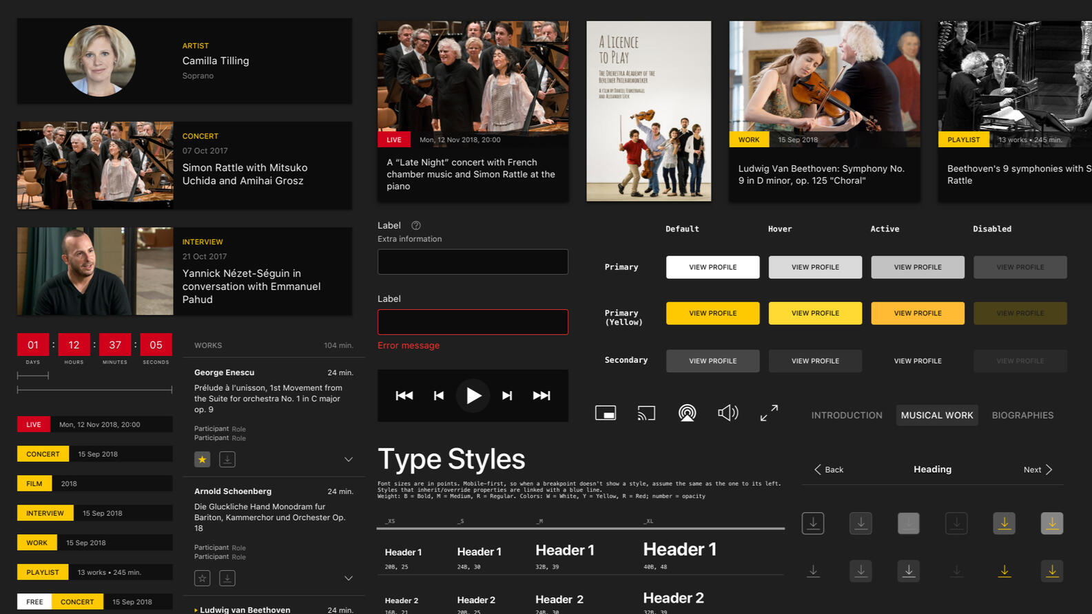
Design System
Email Design
Overview
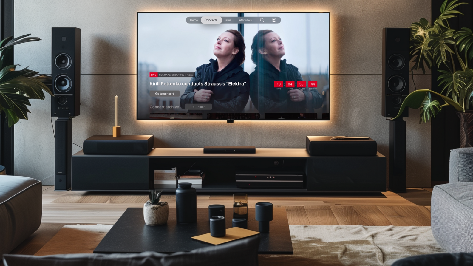
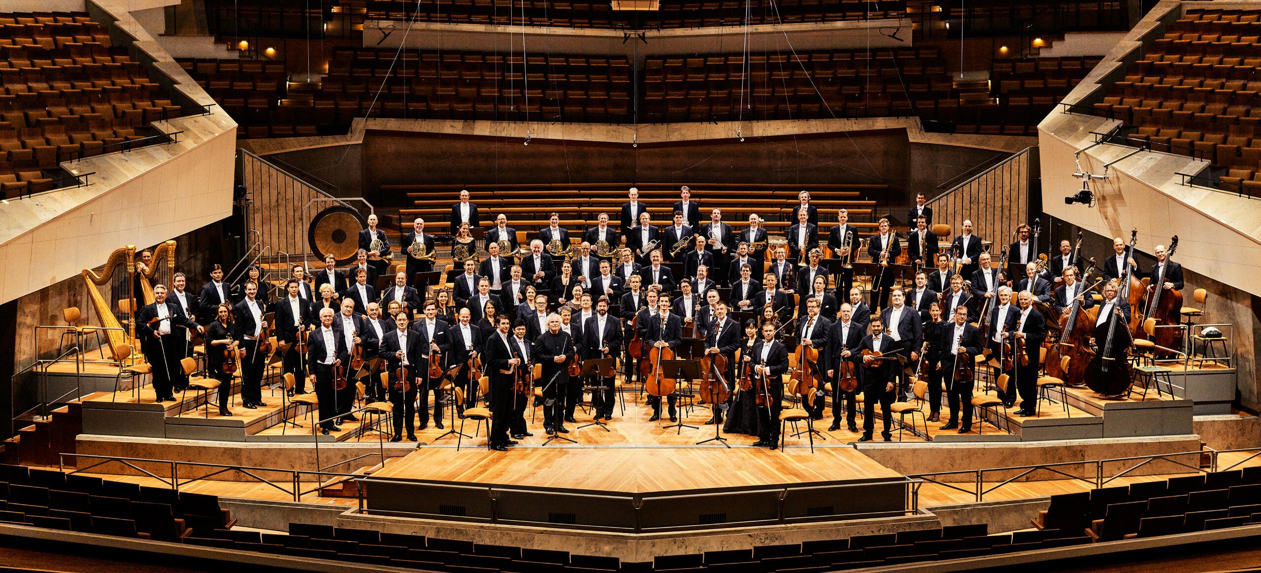
The Berliner Philharmoniker is ranked one of the top orchestras in the world. Their Digital Concert Hall is a pioneer of its kind, streaming premium, original content to subscribers—on practically any device–since 2008. We worked closely with the team to solve the difficult problem of user experience consistency across a constantly changing tech environment, maintainability and team inclusion.
Background
As a streaming service with original, high-quality content and a passionate following around the world, it's no wonder the Digital Concert Hall has been a hit from day one. But the device landscape has shifted several times since 2008, and as the number of clients multiplied, problems began to surface.Without a centralized design team, the interface was recreated for each new client, with different user flows, creating a dissonant experience for users—and a difficult task for the BPH team.
The challenges
1. Meet the diverse and constantly evolving requirements of each platform, while maintaining a consistent feel and recognizable brand.2. Simplify and unify app components and user flows, leaving room to leverage each platform's strengths.3. Work swiftly within a small, startup-like structure and help create better product design processes.4. Understand our users, their realities, desires and needs and deliver an experience that feels as premium as the content.5. Prioritize accessibility and inclusion.
Our process
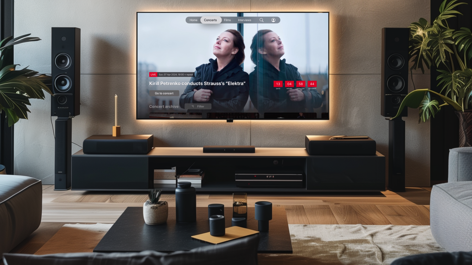
For the launch of the tvOS app store, we got to rebuild the app from the ground up. We worked closely with our Smart TV team as well as Apple and delivered an experience that delighted users, as well as stakeholders, collecting an "App of the Year (Japan)" award.
The design system
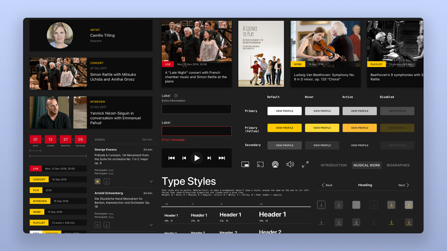
With full client approval, we moved on to the next question: how to port this successful experience to all other platforms?The answer was a platform-agnostic design system. This not only facilitated the design of new clients, but also streamlined communication with developers.

Closer to users
Next up was the crown jewel of the Digital Concert Hall, the web app which was where it all started in 2008. In that time the app had remained fairly unchanged. With that redesign complete we would have overhauled the entire product suite of the Digital Concert Hall with apps on almost every single platform: web, iOS & Android (both mobile and tablet), Smart TV, tvOS and Windows desktop).✔ Redesign of web app, launched in 2022
✔ Focus on user-centered design and accessibility
✔ Through metrics, realized we needed to simplify and optimize the subscription model
✔ Implemented more actionable metrics
✔ Creating the foundation for a more data-driven roadmap
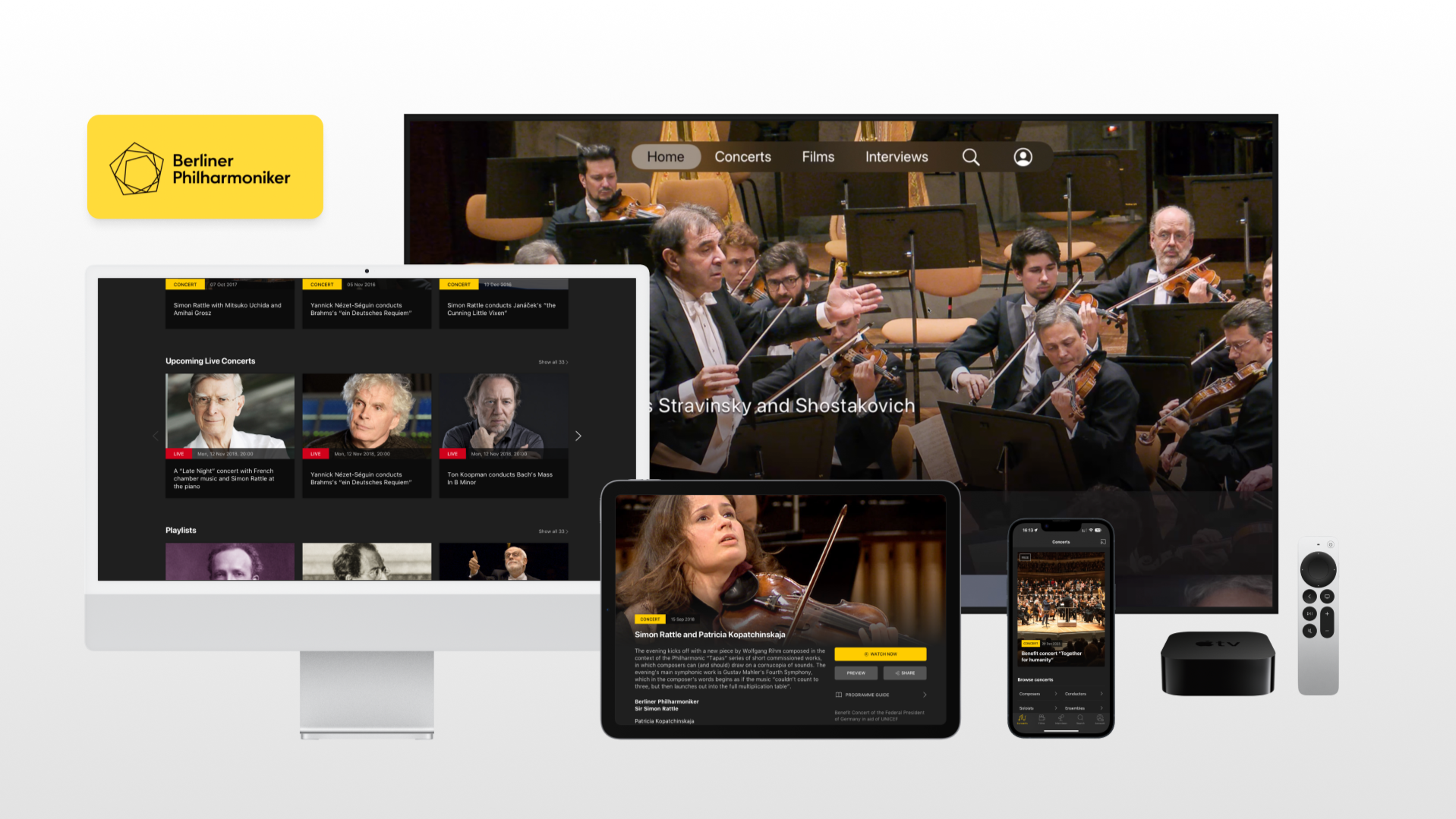
The Berliner Philharmoniker's Digital Concert Hall continues to thrive and continues to evolve and expand to new platforms with the design system we created as the foundation.Enjoy and experience it for yourself at digitalconcerthall.com.
The Reykjavik City Planning Project
Client
Reykjavik City
Deliverables
Product Discovery Workshops
Web App Design
Branding & Editorial Design
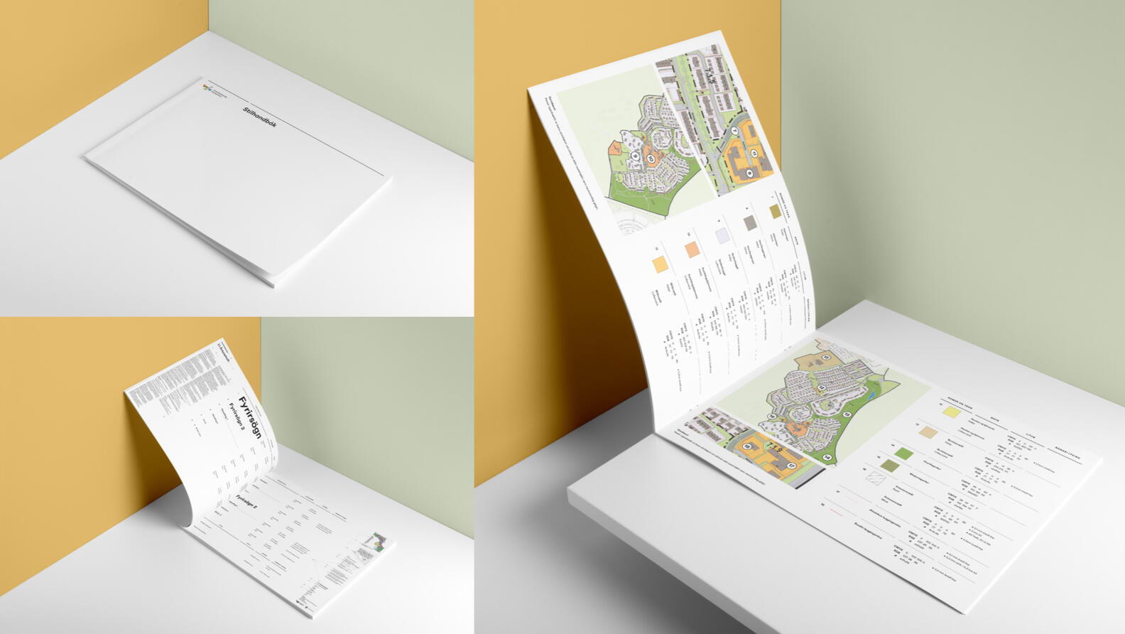
Styleguide
Overview
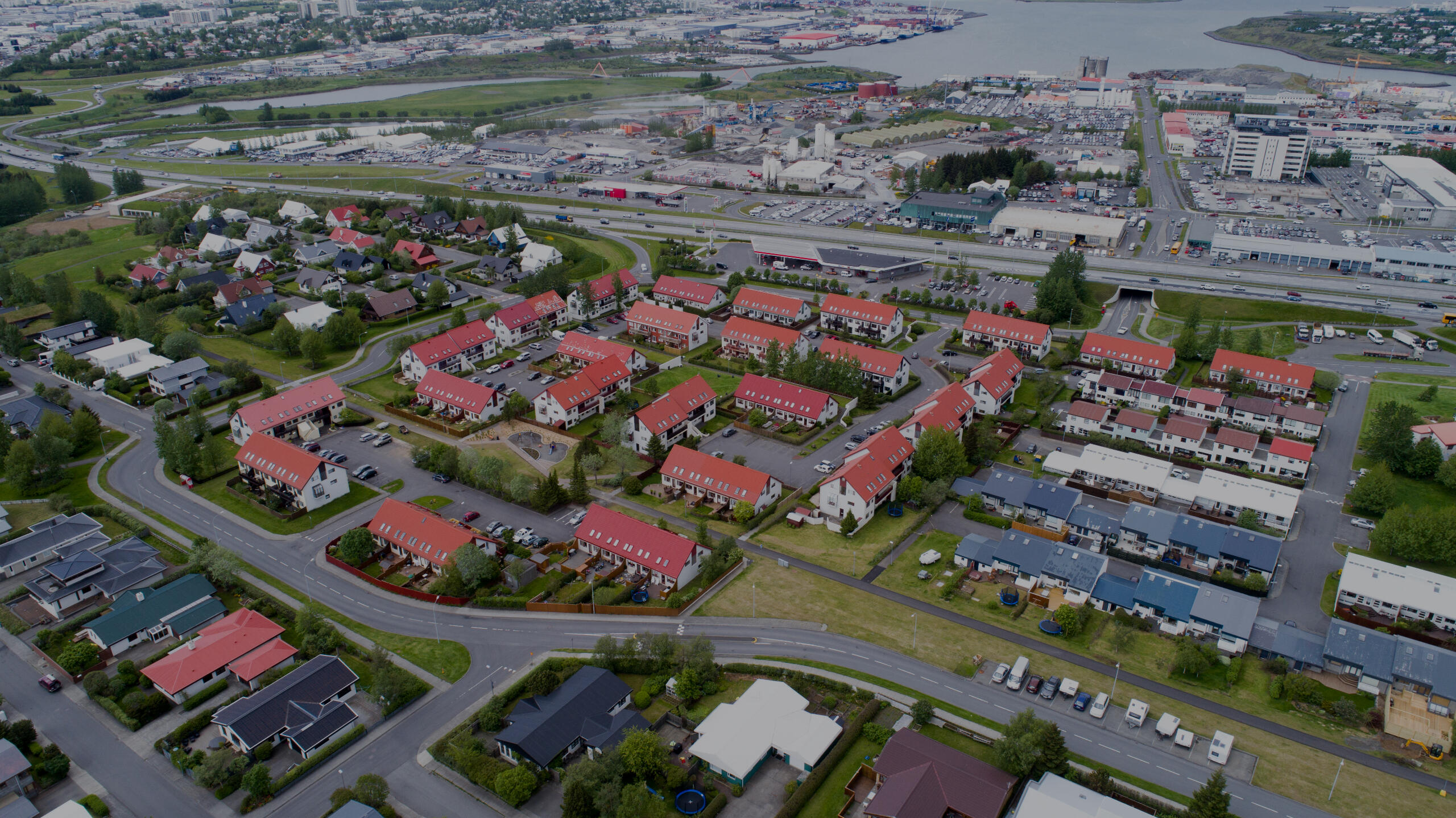
The capital of Iceland, like many cities in the world, faces the problem of urban sprawling. With a fast-paced population growth, ambitious urban planning principles have been set for the next decades. To achieve this, the city's digital tools are the first step; both citizens and professionals (i.e. architects and engineers) need access to information about what and how they can build. We brought the human-centered mindset into the team to find the problem and bring together a concrete solution: a new, modern portal that is scalable, accessible and user-friendly.
Background
To address the growing urban density problem, the city wanted to update its urban planning process and move context to neighborhoods rather than arbitrary plots. They wanted to create a self-service information system to make official planning more accessible to the public.
The challenges
1. Serving 3 different types of user:
a. City Employee
b. Professional (i.e. architects and engineers)
c. Civilian2. Improve and simplify workflows, both in-house and outsourced.3. Create a robust and consistent visual language so materials created by firms would carry the same message.4. To make complex information readable to laypersons.5. Turn an outdated system, with massive amount of information-dense documents (Excel files) into accessible and usable data.
Creating the Planning web app
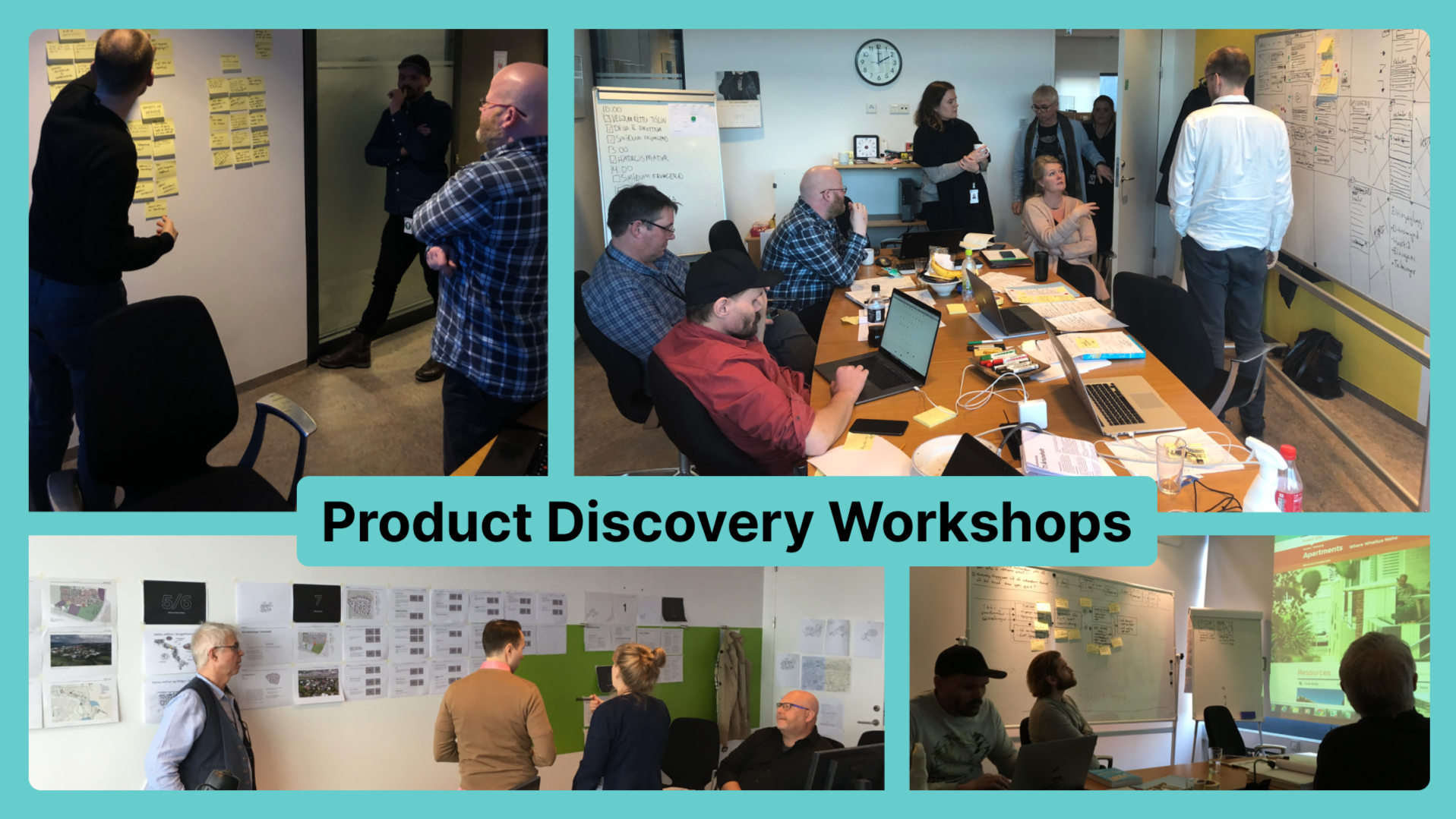
Through a preliminary workshop, we diagnosed a fragmentation, both in online information and expert knowledge within the government itself. Already running multiple online portals, each providing access to its own set of information, the City of RVK teams were siloed and not working together.
How we solved it
– We ran product discovery workshops with core experts within the organization, directing staff’s focus towards the user experience.
– Unpacked locked-in information through discussions and exercises.
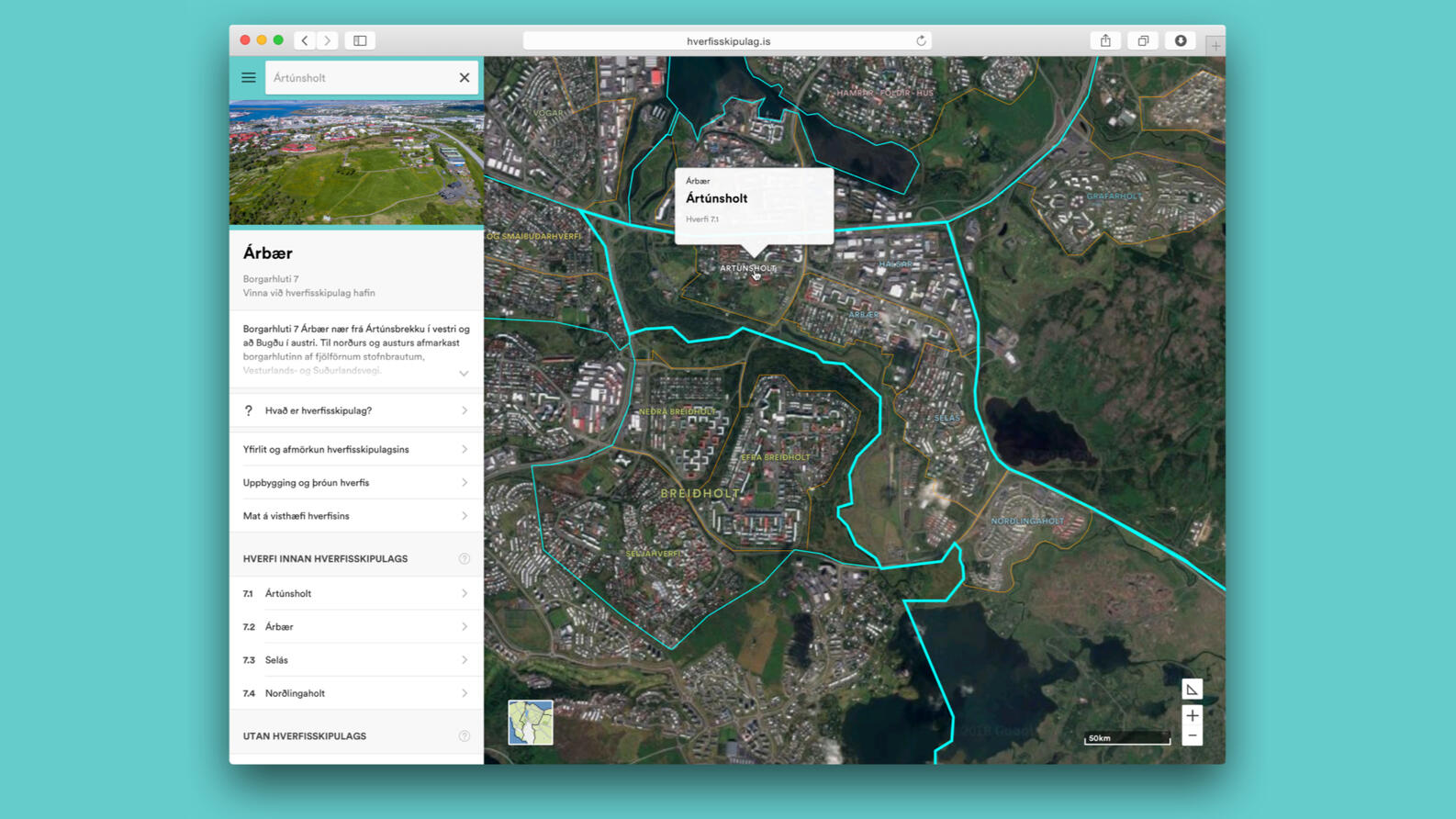
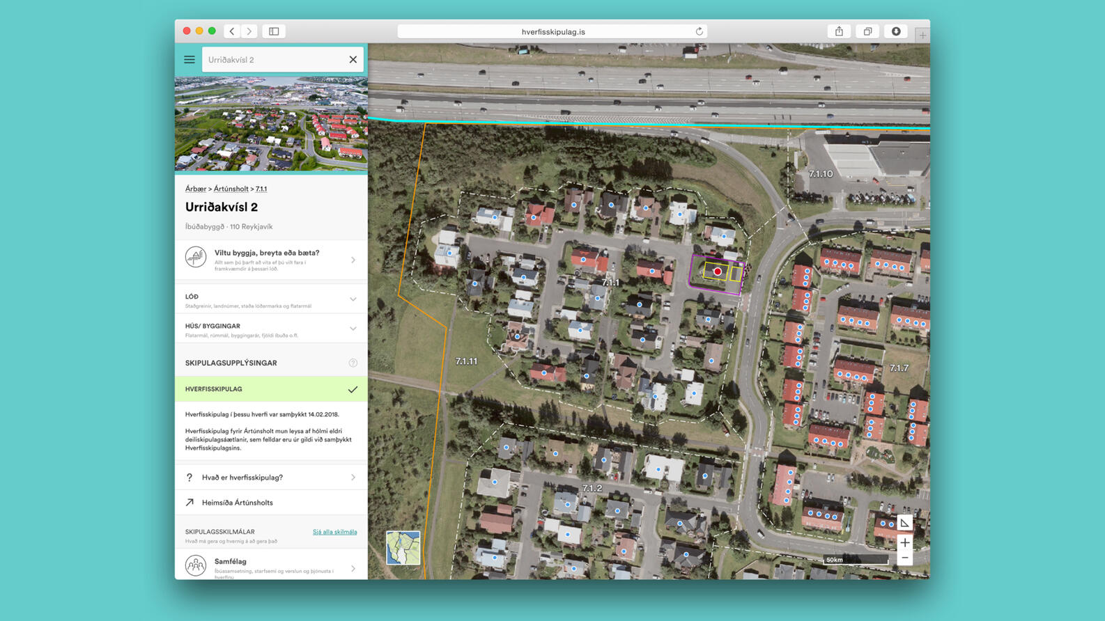
– Created a searchable portal with all information regarding any given property in one place.
– Leveraging the City’s rich databases giving users more info: Architectural plans, Measurements, Aerial photos, Permit forms, Rules and regulations, etc.
– Designs account for multiple stages of the planning process.
– Mobile friendly UI very important - designed mobile first.

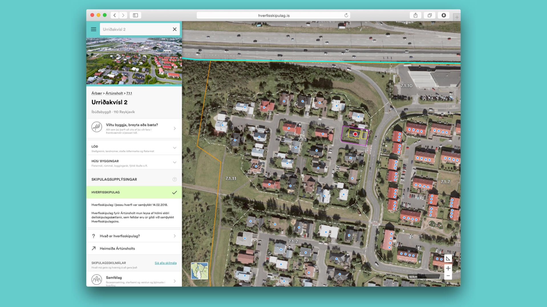
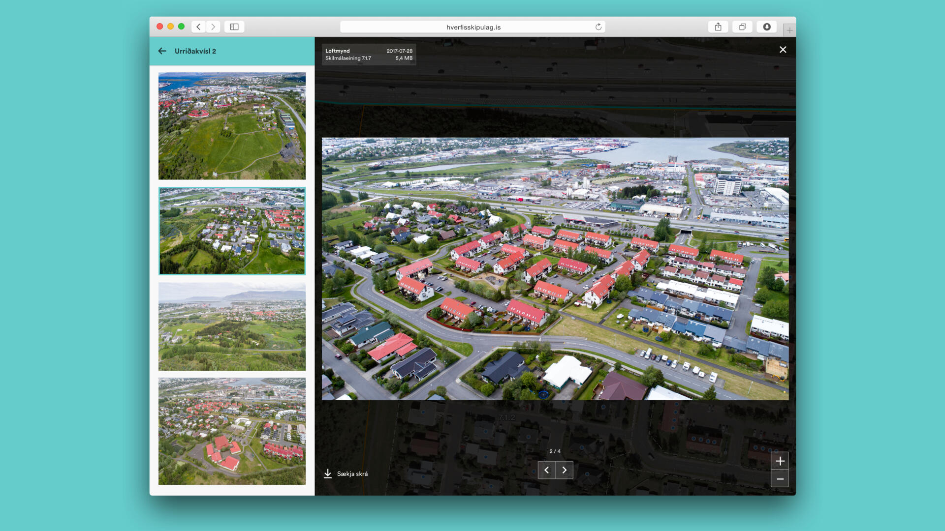
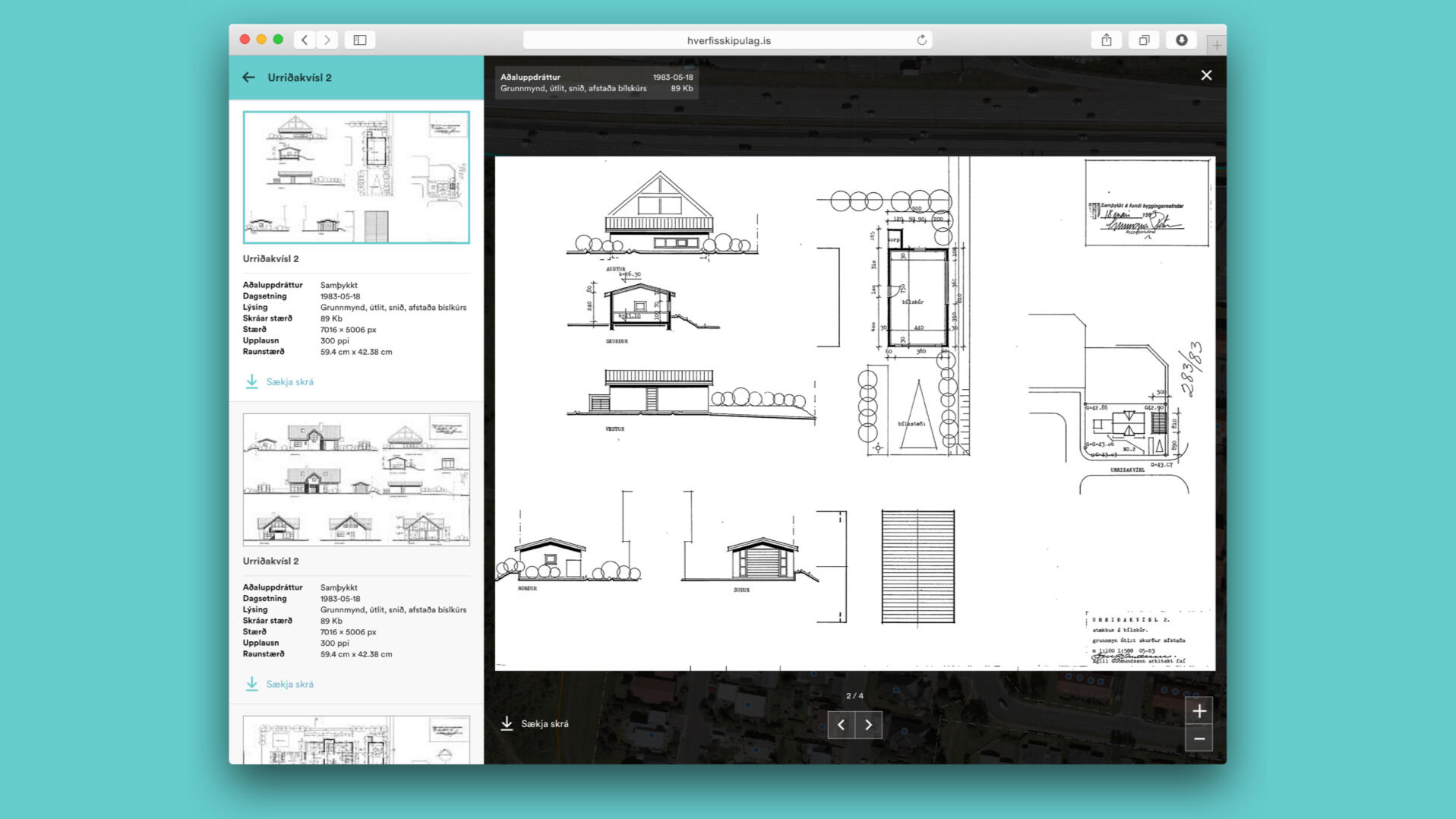
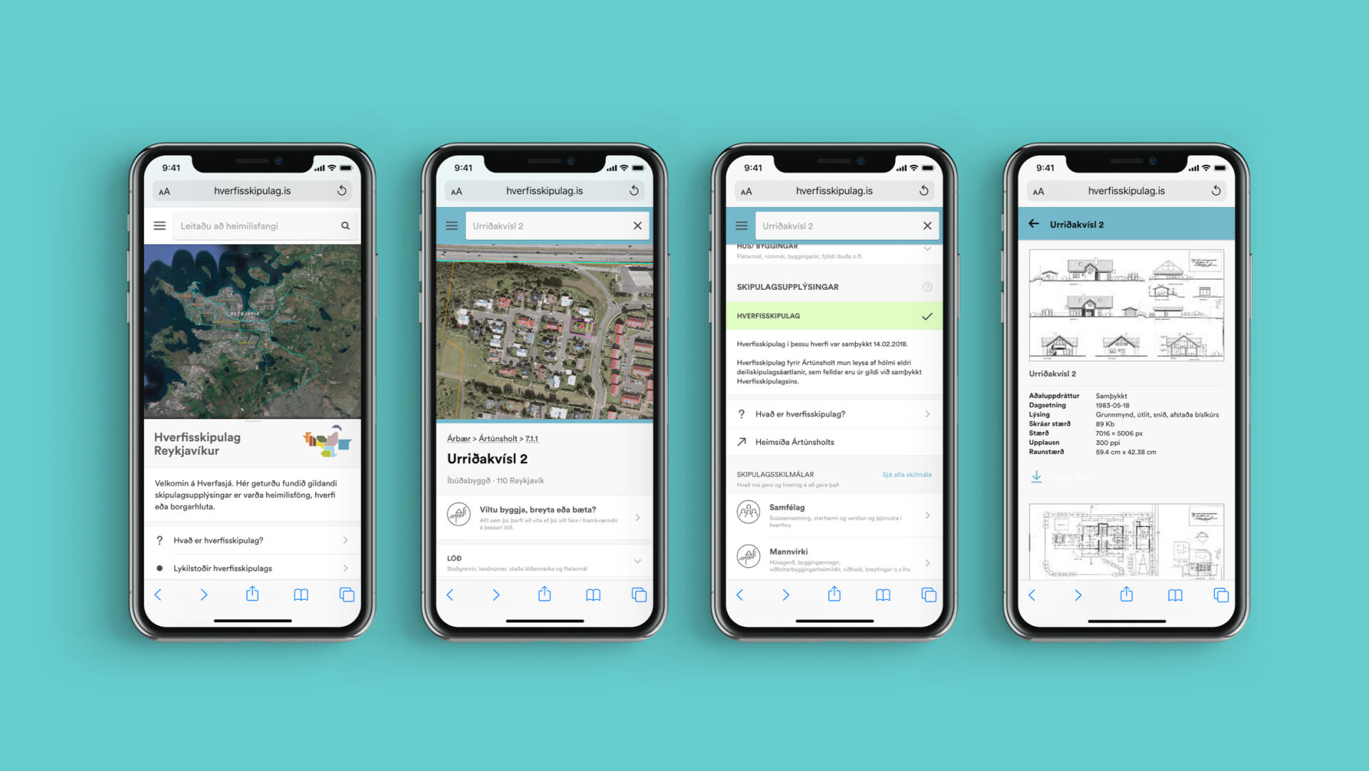
Standardizing the planning posters
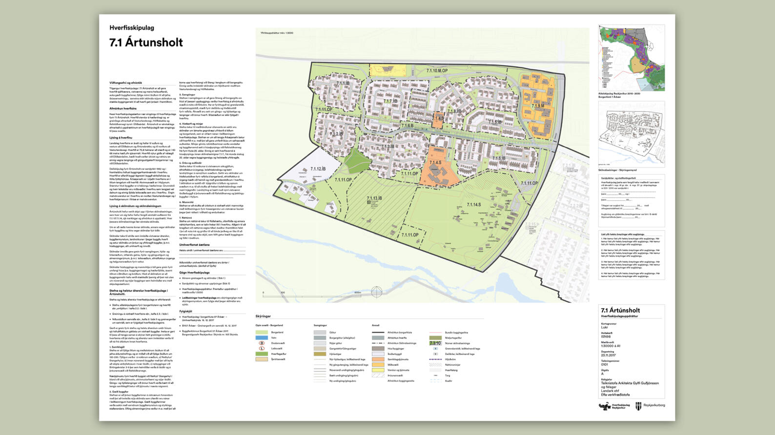
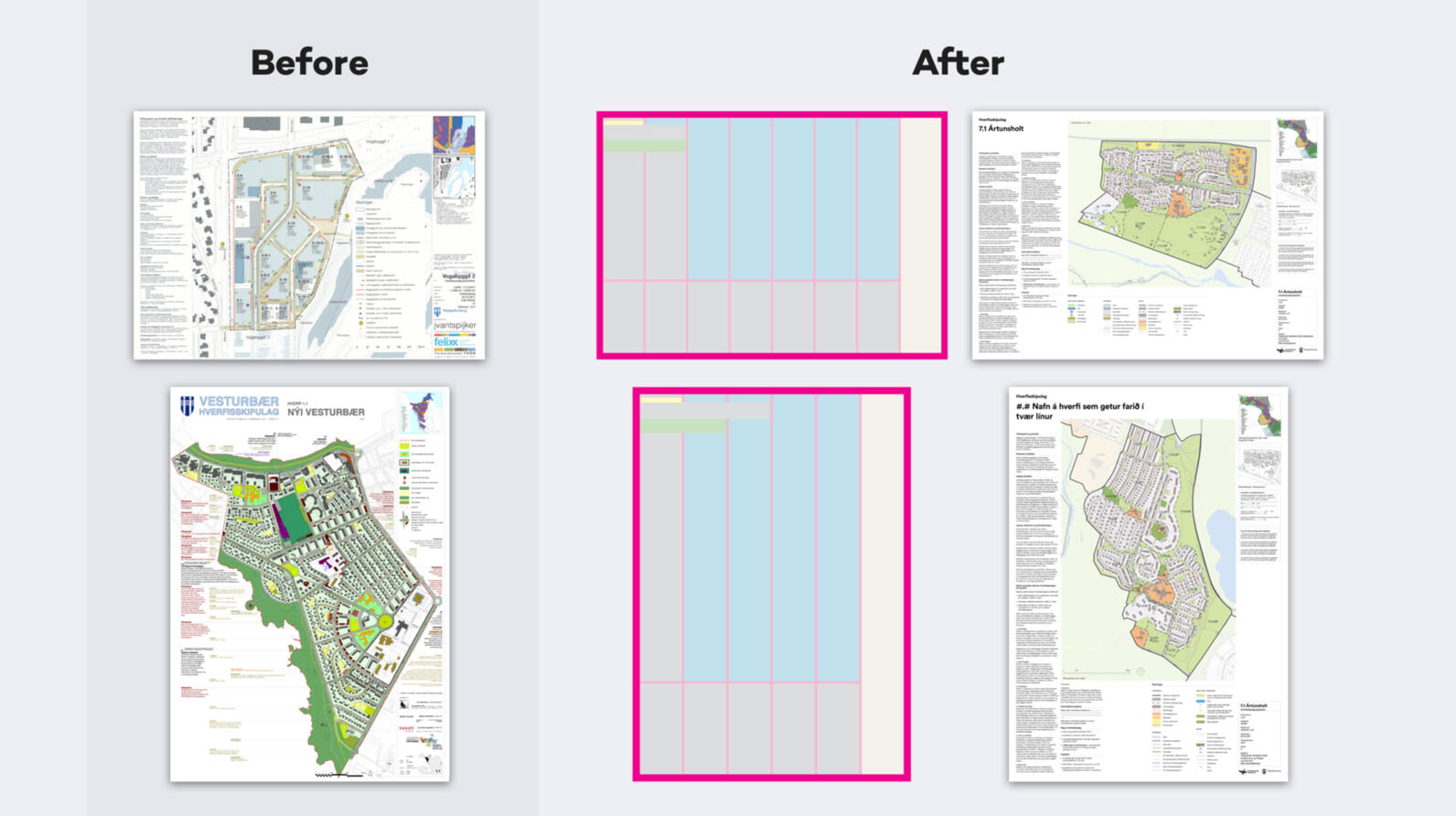
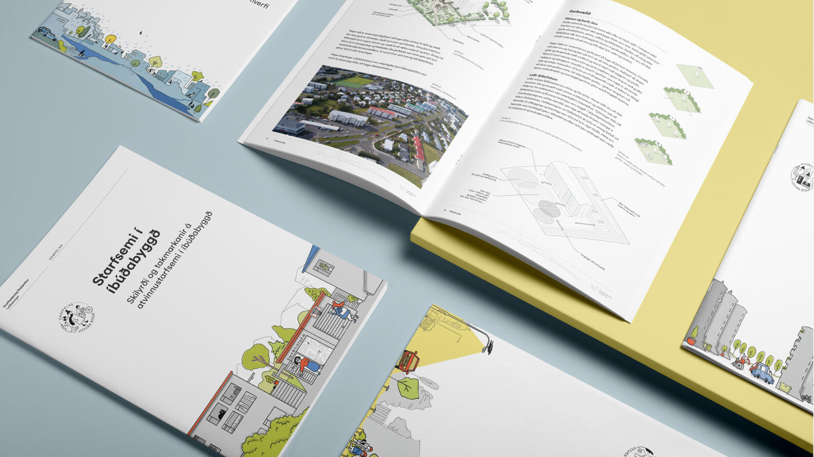
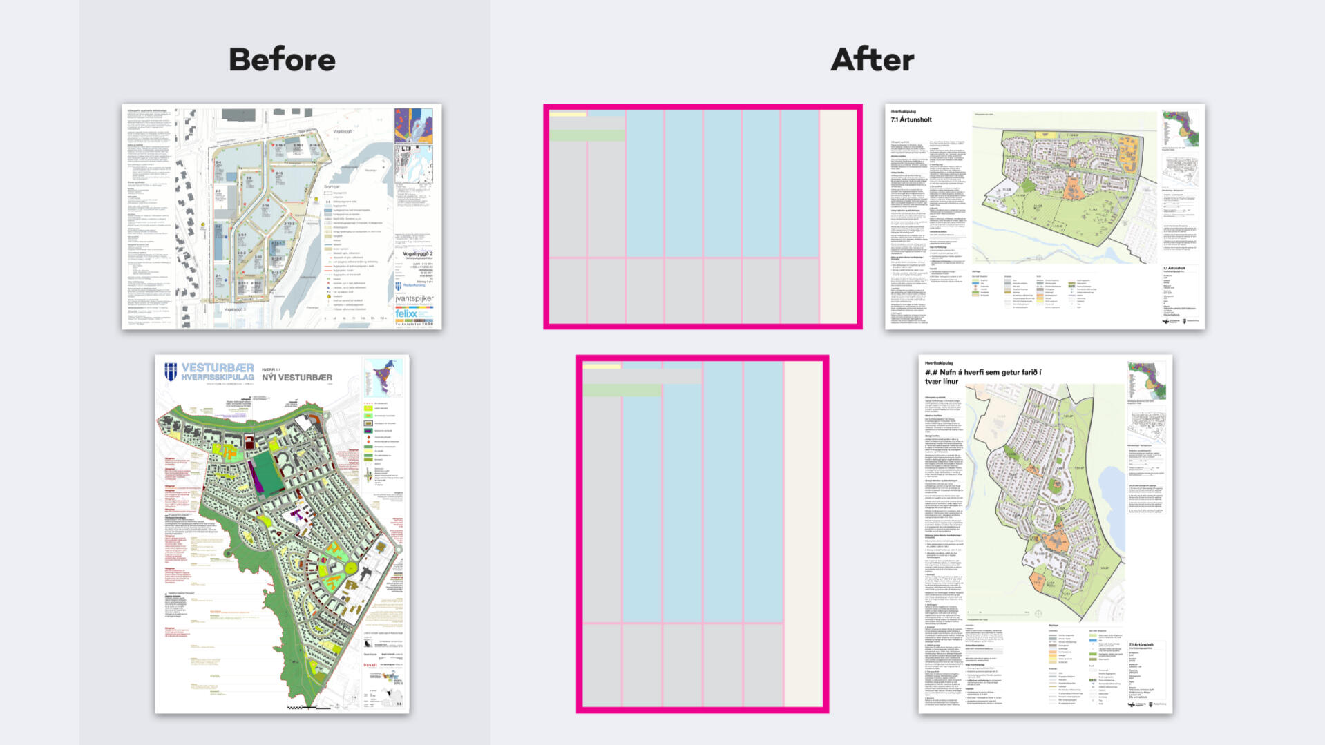
Our first step was improving the planning posters—complex, information-heavy maps that had no standards or guidelines for visual design. Instead, each architecture and engineering firm created their own poster, with their own styles.We communicated with engineers working for the city to better understand their process and tools. We focused on simplicity and readability, and took into account the more broad-stroke (but legally binding) styles from the planning level above, creating visual styles that felt part of the same process.


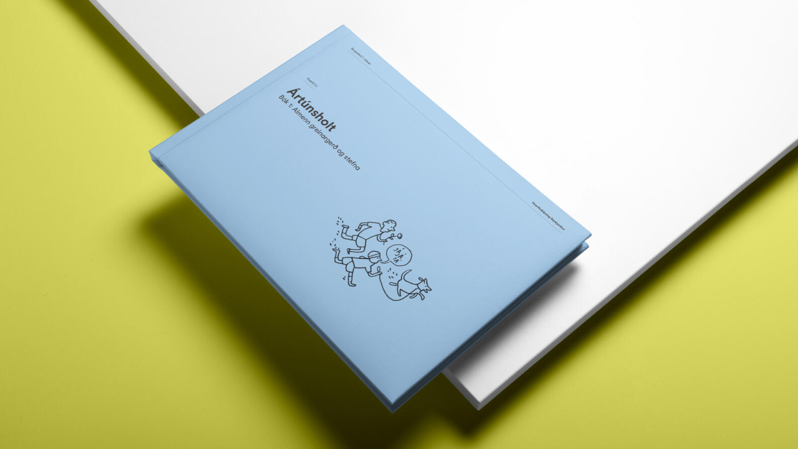
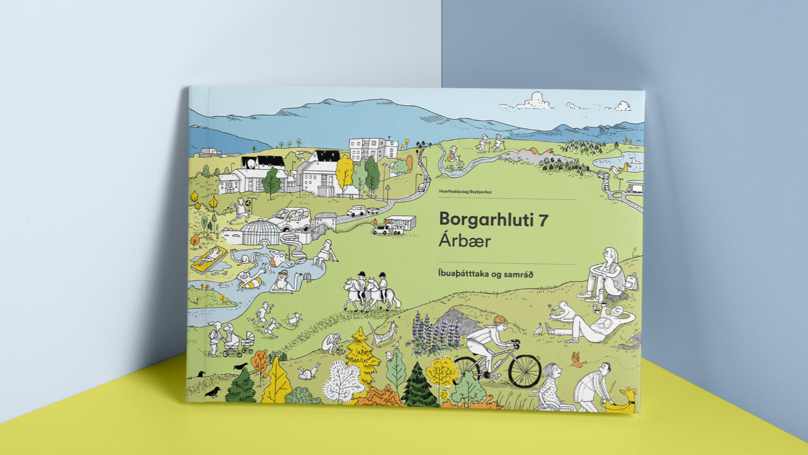
Redesigning the planning books for scalability and collaboration
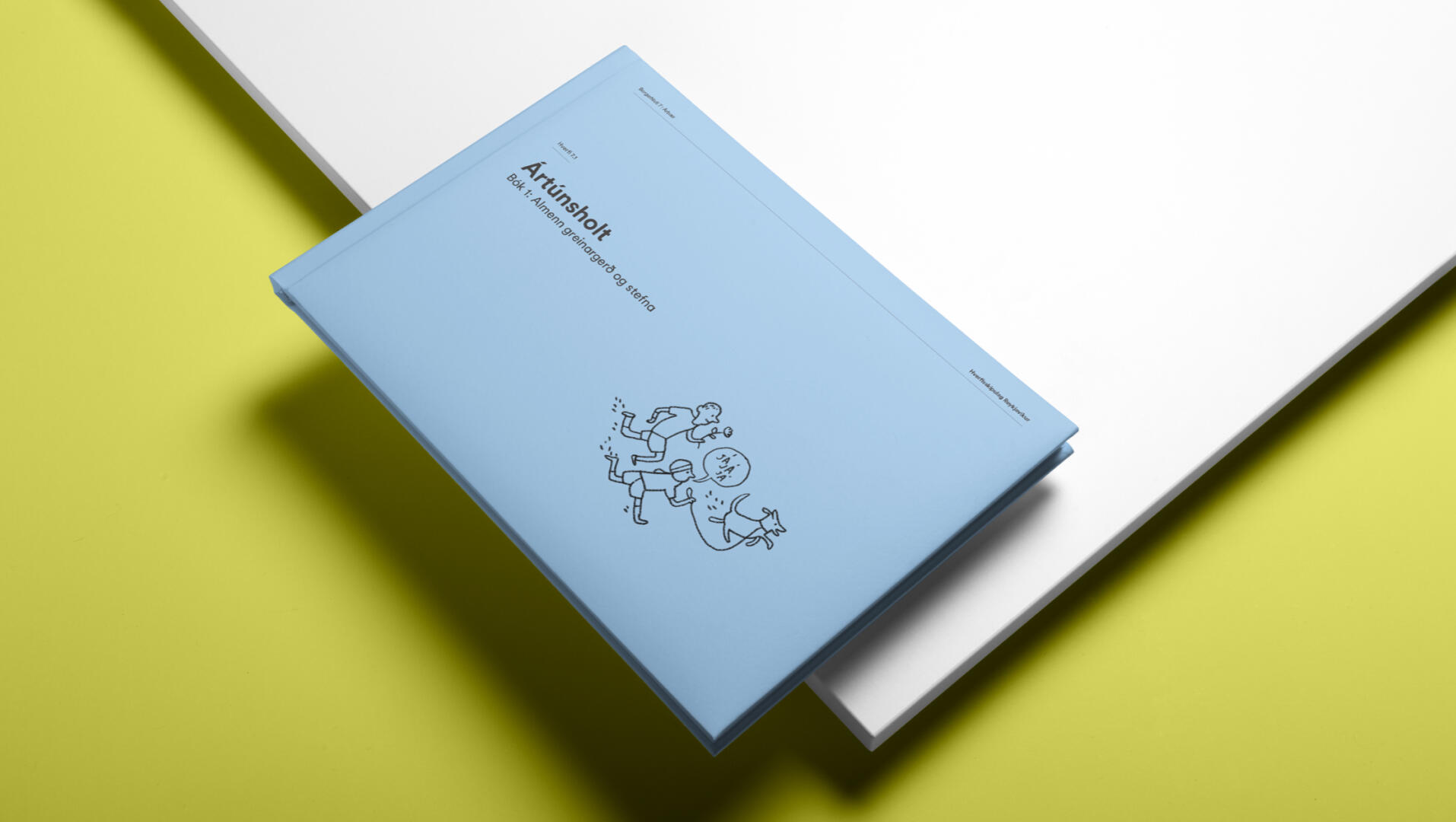
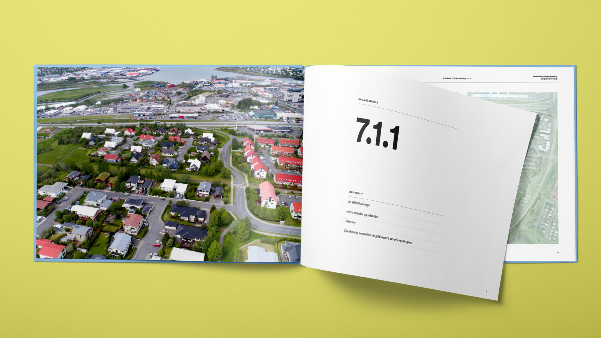
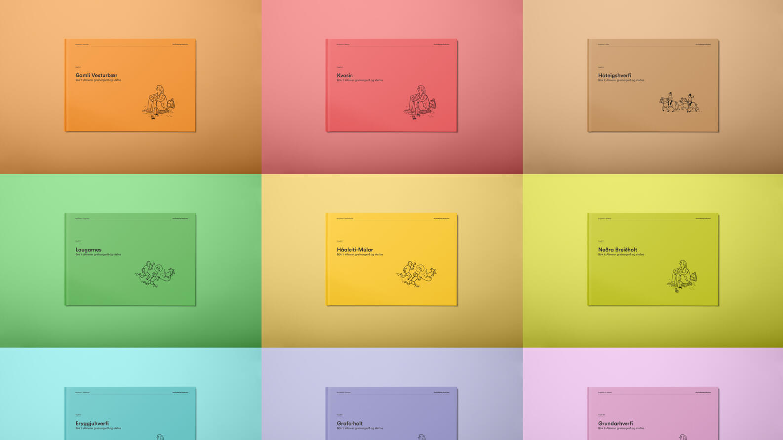
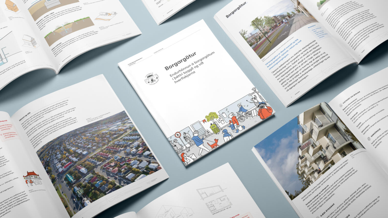
These are very technical and dense books, not easy to consume. They target two audiences with different needs: the public, and politicians. 30 books must be produced and updated over the space of years, which can be slow and costly if outsourced. On top of that, it had an overcomplicated visual system, lacking in functionality and accessibility.
– Ox worked onsite to help integrate the team and understand the challenges.
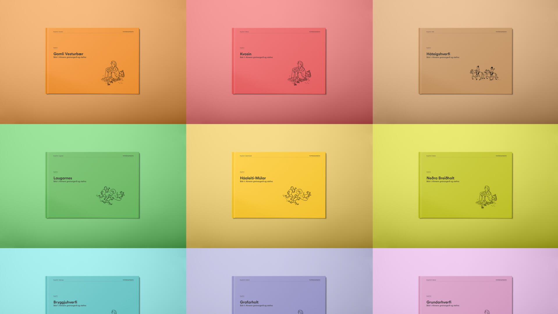
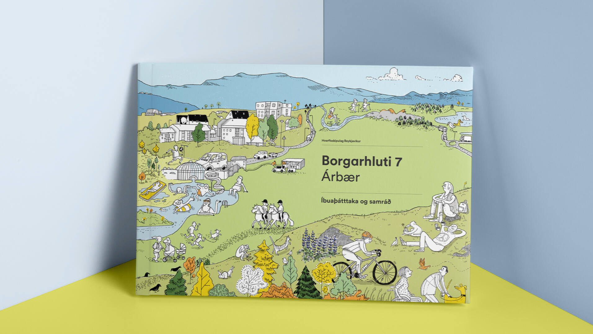
– Collaborated with illustrator Rán Flygenring to create micro stories from citizens’ POV in relaxed and organic illustration style to contrast with the hyper technical source material.
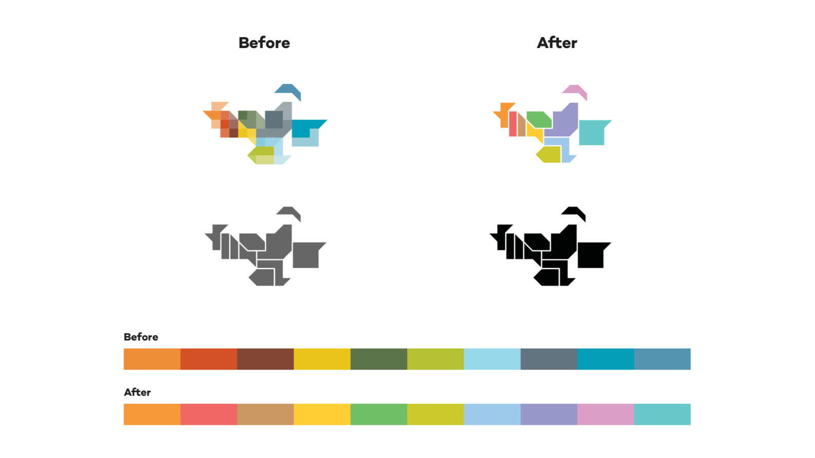
– Simplified logo and color system.
– Design focused on readability and accessibility. Optimized for both screen and print.
– Created processes so they could do the layout work in-house.
– Focused on creating automated processes for speed, reliability and ease-of-use.
